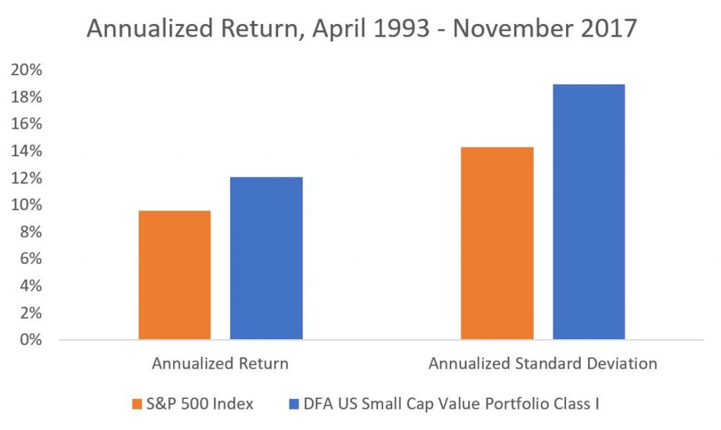
Dimensional Fund Advisors was one of the first vehicles that gave investors access to the small and value premiums. These premiums enabled investors to earn a higher investment return.
But, in investing there is rarely a free lunch – with Modern Portfolio Theory being the rare exception. It was only by bearing the greater risk of holding small/value stocks that an investor could be rewarded with a higher investment return (on a very long timeline). Yet, if the investor’s goal was the highest investment return available, then it made sense to bear the greater risk of small/value stocks for the chance to earn the small and value risk premiums and therefore earn a higher investment return.

But for many investors, risk plays a critical part in shaping the ideal portfolio for the client. For most, only so much risk can be absorbed. It is this finite tolerance for risk which is why many investors hold to choose not just stocks, but bonds as well (with bonds functioning to decrease the overall portfolio risk).
Since risk tolerance is finite for many investors, the objective should then be not to capture the largest investment return available, but the largest investment return available given a finite amount of risk. This is where classical Modern Portfolio Theory (MPT) goes to work. With MPT, investments are selected on the basis of their relationship to each other. (It is this selection basis that makes a strong case for U.S. government bonds in a portfolio. This is given that U.S. government are an investment holding a truly unique hedging property.)
Do Riskier Investments Make Sense if Risk Tolerance is Finite?
The small/value premium has been championed by Dimensional Fund Advisors and others as a way increase investment return. However, this return premium is only manifest at the expense of a risk premium. So, does holding seemingly riskier stocks (i.e. small/value) make sense if your portfolio has a goal to limit risk (by holding bonds)? Would it simply make more sense to capture increased investment returns by holding more stocks instead of holding riskier stocks? To answer this question, let’s consider an example.
It has been determined that a client’s risk tolerance, investment timeline, and goals warrant a 70% equity portfolio. How much of the 70% equity (if any) should be allocated to small/value stocks? Let’s run the numbers to find out.
A portfolio holding 70% United States stocks (CRSP 1-10) and 30% U.S. Five-Year Treasury Notes produced an investment return of 8.7% per year from April 1st, 1993 to November 30th, 2017. This was at the expense of almost 10% standard deviation. For this analysis, we will measure standard deviation as a measure of risk. (The portfolios are rebalanced every 12 months.)
| Portfolio | Annualized Rtrn | Annualized Std. Dev. |
| A: 70/30 – CRSP | 8.7% | 9.9% |
As mentioned, conventionally seeking a greater investment return meant bearing greater risk via increased stock holdings. Increasing equity allocation in Portfolio B by 10% demonstrates this: greater return is available at the expense of greater risk.
| Portfolio | Annualized Rtrn | Annualized Std. Dev. |
| A: 70/30 – CRSP | 8.7% | 9.9% |
| B: 80/20 – CRSP | 9.1% | 11.4% |
But for our investor with a finite tolerance for risk, this is not an appropriate solution. Additional risk simply cannot be tolerated.
If increasing equity exposure means taking on more risk (i.e. more risk than the investor is able to bear), is there a better alternative? What about tilting equity exposure towards those small/value premiums that have historically outperformed? To answer this question, I constructed Portfolio C using 30% U.S. Five-Year Treasury Notes (the same as before), 35% United States stocks (CRSP 1-10), and 35% of a Dimensional Fund Advisors mutual fund that seeks out the small/value premium.
| Portfolio | Annualized Rtrn | Annualized Std. Dev. |
| A: 70/30 – CRSP | 8.7% | 9.9% |
| B: 80/20 – CRSP | 9.1% | 11.4% |
| C: 70/30 – CRSP & SV | 9.9% | 10.8% |
As is expected, the investment return in Portfolio C increased relative to Portfolio A, a standard 70/30 blend without exposure to the small and value premiums. This is because small capitalization and value stocks have historically outperformed the broad market on relatively longer timelines. However, the risk of the Portfolio C increased relative to Portfolio A, a standard 70/30. So again, more risk can be had only by enduring greater return. This makes sense and is consistent with basic investing theory. Return increases as risk increases.
So far, we know that a portfolio holding more stocks earns a higher return, but at the expense of higher risk. We also know that a portfolio holding riskier small/value stocks also earns a higher investment return – but again at the expense of greater risk.
In short, there are two ways that you can earn a higher investment return for bearing greater risk:
- Hold more stocks
- Hold riskier stocks
Is one way for earning a higher return (at the expense of greater risk) better than the other? Let’s look at the numbers more closely to find out.
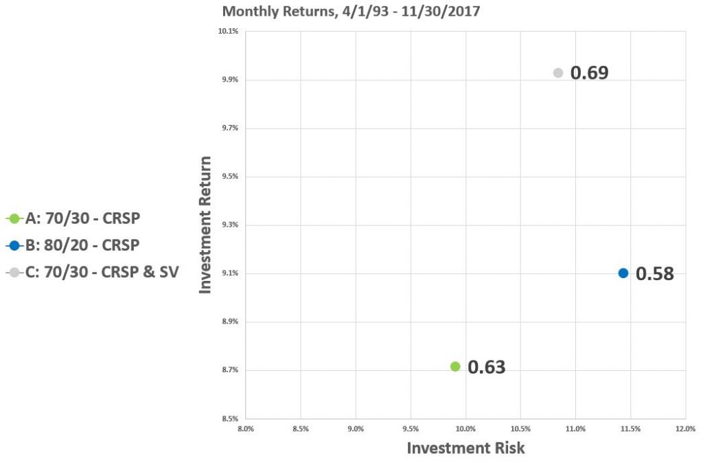
Portfolio A, our benchmark, holds 70% stocks. Portfolio B, holding 80% stocks, offers about 0.4% greater return, at the expense of 1.5% greater fluctuation in value. Again, greater return at the expense of greater risk.
Compare this to Portfolio C, which offers an additional 1.2% of extra return at the expense of just 0.9% greater standard deviation. The math is clear. It may make more sense to bear greater risk by holding riskier stocks than by holding more stocks – given the goal of superior risk-adjusted return.

We can see this phenomenon visualized above in the scatterplot, with the Sharpe ratio of each particular portfolio showcased.
A quick side note on reading a risk/return scatterplot: The best portfolio in the world would exist in the upper left quadrant: earning the highest return for bearing minimal risk. The worst portfolio in the world would exist kitty corner, in the lower right. You likely never want to hold a portfolio existing low and to the right on a risk/return scatterplot. Doing so would mean enduring great risk for little return. Normally, distinct investments form a curve that starts in the lower left, and moves up to the right. This is the phenomenon of increasing investment return being had for increasing risk. And now back to the rest of this blog post.
See the green dot. This is Portfolio A, our benchmark. This is a portfolio of 70% stocks. No compare the green dot of Portfolio A to the blue dot of Portfolio B. Portfolio B holds more stocks, and as such earns a higher investment return. However, this higher return comes at the expense of greater risk. Relative to the green dot of our benchmark Portfolio A, Portfolio B is up and to the right. Again this falls in line with investing 101: Portfolio B offers a higher return than Portfolio A. However, this only occurs at the expense of greater risk. This is because Portfolio B holds more stocks than Portfolio A, and is therefore riskier.
But, we’ve already determined that it may make more sense to hold riskier stocks as opposed to simply holding more stocks. See the grey dot, for Portfolio C. Portfolio C offers a greater investment return than Portfolio A or Portfolio B and less risk than Portfolio B. This shows up with Portfolio C being to the left of Portfolio B (less risky) but higher up on the chart (higher returning). The superior performance of Portfolio C over Portfolio B is also manifest in the highest Sharpe ratio for Portfolio C of the group.
Changing Equity Allocation and Opting for Riskier Stocks
This message is clear: holding riskier stocks can make more sense than holding more stocks. However, while this is the case, holding riskier stocks still means making the portfolio riskier. And if the investor has a finite tolerance for risk, this strategy does not make sense, because in the end risk is still increased.
So, what happens if we decrease the stock allocation, but still hold riskier stocks? See the table and chart below.
| Portfolio | Annualized Rtrn | Annualized Std. Dev. |
| A: 70/30 – CRSP | 8.7% | 9.9% |
| B: 80/20 – CRSP | 9.1% | 11.4% |
| C: 70/30 – CRSP & SV | 9.9% | 10.8% |
| D: 60/40 – CRSP & SV | 9.4% | 9.2% |
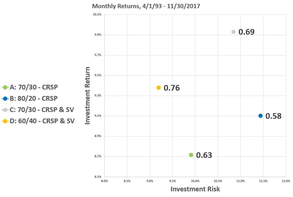
In Portfolio D, we’ve decreased the equity allocation down to 60%, with equity allocation evenly split between a broad market fund and our small/value fund.
For Portfolio D, holding less stocks manifests bearing less risk than our comparison portfolios. This is despite holding riskier stocks than Portfolio A. However, the riskier stocks generate a higher investment return for Portfolio D. This is visualized in the following scatterplot:

Portfolio D, in orange, and is up and to the left of Portfolio A, in green. Said another way, Portfolio D offers less risk and higher return than Portfolio A. It is simply a better portfolio (or at least has proven to be so historically).
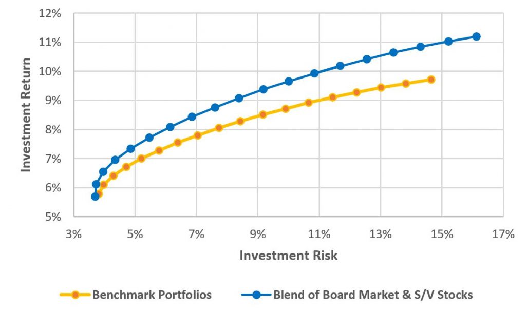
Moreover, this works across all equity allocations. It is not unique to a 70/30 mix. The following scatterplot shows the efficient frontier of two types of portfolios. In orange is the benchmark portfolio. This type of portfolio holds a blend of U.S. stocks (CRSP 1-10) and five-year Treasury notes. Each plot point represents and an increase in equity allocation by 5%. In blue, our comparison portfolio has equity allocation split between CRSP 1-10 and the DFA small value fund. The makes a strong case that adding small/value stocks to a portfolio, as it manifests superior risk-adjusted return.

Capture the Small Value Premium
Given the results, the solution appears obvious. Seeking out the small/value premium may make sense given the excess superior risk-adjusted return available. Moreover, it may even make sense to dial back equity exposure in a portfolio while increasing risk via the small/value premiums because those premiums may more than make up for the added risk.
As a final caveat, it is impossible to know if these premiums will persist in perpetuity to degree that they have performed in the past.
Leave a Reply