I had an article published in the Journal of Financial Planning on dollar-cost averaging. You can read it here. You can also download a Powerpoint presentation version of it here.
I have received the same questions from advisers over and over again, both in person at presentations, and via email from those who had read the piece. They’re all asking the same thing:
“Hey Jon, it’s great that you found this pattern on 15-year timelines, but 15 years is far too long for me to implement this. Can’t I do this on a short timeline?”
Before I answer that question, let’s look at it a little closer. Just by looking at this question, we can likely determine the answer.
Short-Term Investment Strategies
The critical piece here is the comment about wanting something on a shorter timeline. If it’s not already obvious, investing is a process for long-term gain. No one knows what you’ll get in the short term. For that reason, any investing strategy shouldn’t work in the short term. At least I have not found an investing strategy that would outperform a low-cost index fund in a short term.
Can you use this DCA/CAPE strategy on a short-term timeline? Of course not! When I was originally putting the paper together, I examined increasingly longer timelines to find a pattern in the relationship. At first, I looked at five-year timelines. I did not find a significant correlation. I then doubled that to 10 years. Still, I didn’t really have any valid data point worth presenting. Only at 15 years did a data pattern emerge, and rightly so!
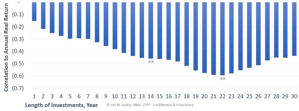
This is because the CAPE metric is a long-term market valuation tool. It can’t be used in the short term. Consider the following chart outlining just this concept.

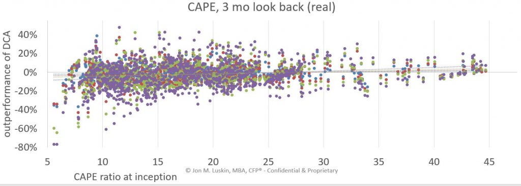
Notice how CAPE is much more effective at determining your investment return on a long timeline. On short timelines, it’s almost worthless. Here’s a little bit more of the same data but attempting to apply dollar-cost averaging on a short timeline to achieve outperformance relative to starting CAPE ratio.

As you can see, the line is almost flat. There is little to no relationship. Compare this scatter plot to the scatter plot in the original paper.

There is a stark contrast between the two. Using a 15-year timeline makes it quite clear that there is a relationship, as illustrated in my paper in the Journal of Financial Planning.
New information on the CAPE ratio
Since I started writing this paper, more studies have pointed out the challenges of using the CAPE ratio. Jeremy Siegel at Wharton created a paper explaining the shortcomings of Shiller’s CAPE ratio, suggesting alternatives. Therefore, were you to use the strategy outlined in FPA Journal paper today, you may consider choosing to calculate CAPE via the NIPA calculations and not S&P earnings – as explained in Siegel’s paper. However, I think for such an application to make sense, you need to consider the fact that the original paper was written using S&P earnings. For someone to use this strategy, it would likely be appropriate to go back and re-do the study with the NIPA data.
Several members of Vanguard group have put out their own analysis of the CAPE ratio, discussing shortcomings and suggesting an updated technique. Their model incorporates real bond yields into their calculation. Again, it would be interesting to redo the experiment using Vanguard’s algorithm to see the outcome.
Applicability of Using CAPE to DCA
In the end, it was a lot of fun to find a pattern in historical market valuations and returns. The practical applications of the paper however, have certainly changed over time. Given new evidence on the challenges of using the CAPE ratio as an investment metric, it may be inappropriate to apply the findings in the original paper to investment management today. Moreover, it would certainly be inapplicable to attempt this strategy, or any other strategy, using a long-term valuation metric on a short timeline.
Leave a Reply